TomoCredit — Onboarding Redesign: From Drop-Offs to Activation

Product Strategy

UX Content

UX Content

Impact

  • +52% increase in activation completion (Q3 2025).

  • −31% drop in setup-related support tickets.

  • ↑ retention and engagement due to improved education during onboarding.

  • Provided leadership with a clear UX framework to scale future feature rollouts.

91%

91%

completion rate

completion rate

52%

52%

increase of new users.

increase of new users.

1200+

1200+

new users signed up per day

new users signed up per day

Overview
Led a complete redesign of TomoCredit’s onboarding experience to improve user comprehension, trust, and activation rates.
The previous flow caused high friction during application steps and limited clarity around Tomo’s “no credit score required” model.
Through UX simplification, visual hierarchy improvements, and behavioral insights, the new onboarding flow increased Q3 activation by 22% and reduced support tickets related to setup confusion.

Problem
1. Users struggled to understand how Tomo’s credit system worked and often dropped off before completing setup.
2. The process was one long form: lengthy, visually inconsistent, and lacked progress indicators.
3. Tomo needed a unified, data-driven onboarding experience that communicated trust, transparency, and simplicity.

Process


1. Research & Data Analysis

  • Analyzed GA4 funnel data and session recordings to identify major drop-off points.

  • Conducted user surveys and support ticket reviews revealing confusion around “no credit check” logic and linked account permissions.

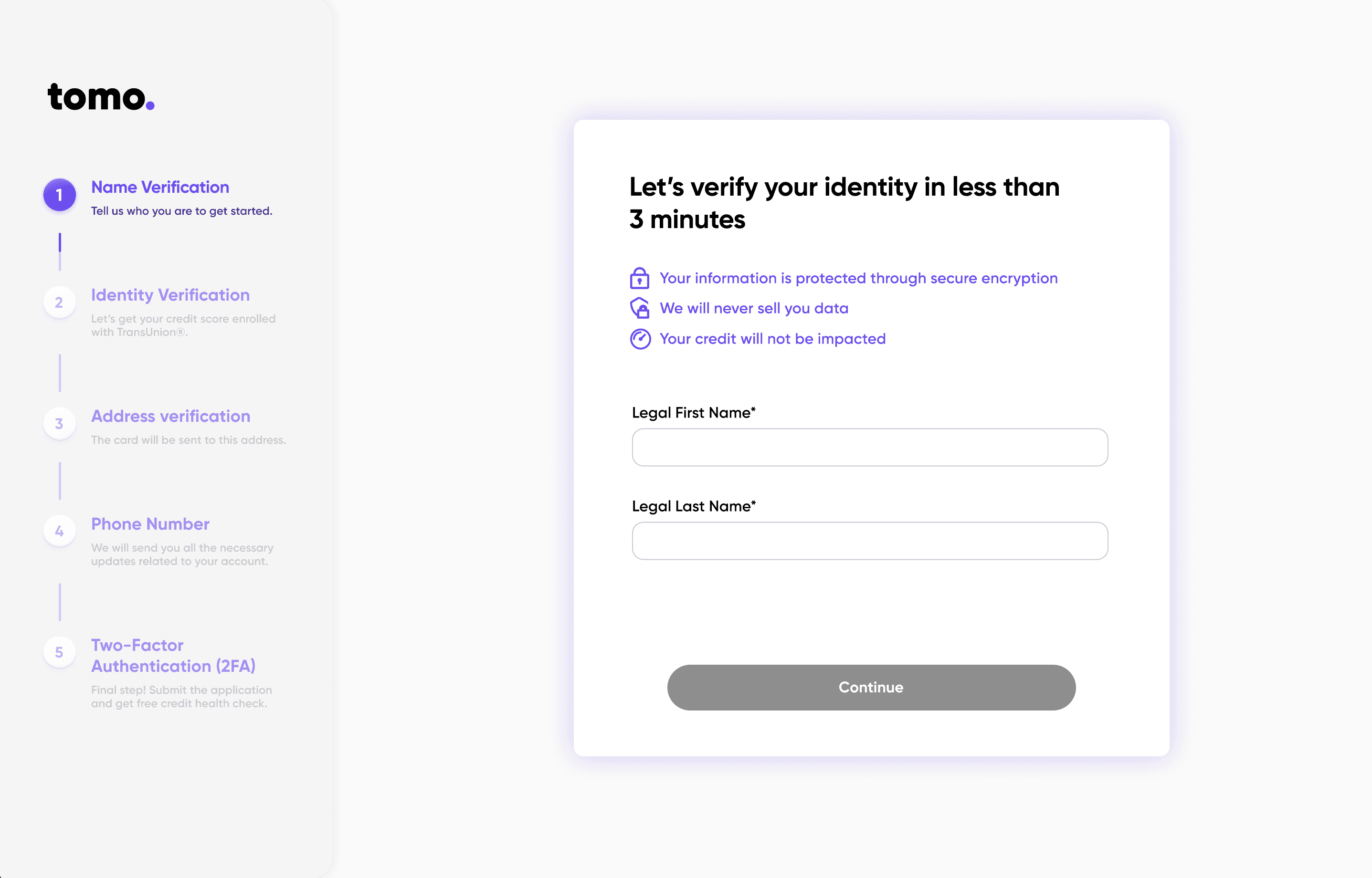
2. Journey Mapping & Information Architecture

  • Created a new onboarding journey map covering pre-sign-up education → KYC verification → first payment setup.

  • Reduced total user actions from one long form into 5 steps/ 5 screens, introducing progressive disclosure and auto-filled states.

  1. UX & Visual Design

  • Built a cohesive design system for onboarding components (cards, modals, checklists).

  • Introduced a “trust layer” using verified partner logos, FDIC security badges, and humanized illustrations.

  • Added step indicators and contextual microcopy explaining the “why” behind each data request.

  1. Engineering Collaboration

    • Partnered with engineers to implement real-time form validation and session persistence (so users could resume onboarding).

    • Integrating TU 2FA

    • Coordinated design QA across mobile and web environments.

  1. Launch & Optimization

  • Launched A/B test for the new flow on Sep 25, 2025.

  • Monitored GA4 and Firebase event funnels for post-activation behavior.

© 2025

All Rights Reserved

vivienkong.x@gmail.com

All rights reserved, ©2025